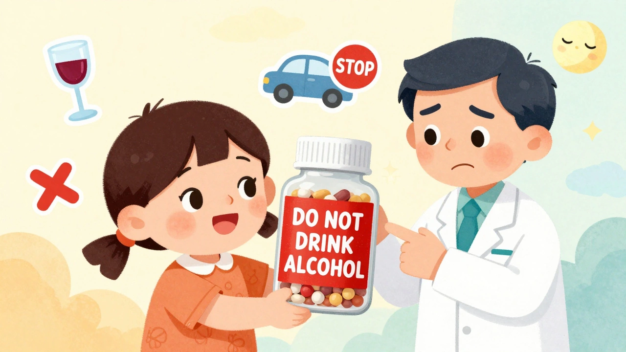
Every time you pick up a prescription, there’s a small sticker on the bottle that could save your life-or hurt you if you ignore it. These aren’t just random notes from the pharmacist. They’re legally required safety alerts, designed to stop dangerous mistakes before they happen. But here’s the problem: most people don’t understand what they actually mean.
What Those Little Stickers Are Really For
Those colorful stickers on your pill bottle aren’t decoration. They’re part of a federal safety system enforced by the U.S. Food and Drug Administration (FDA). Since 1938, the law has required that every prescription container carry warnings that prevent injury. By 2025, over 3.8 billion prescriptions are filled each year in the U.S., and these labels are the last line of defense against deadly errors.Think of them like seatbelts in your car. You don’t always feel like wearing one, but skipping it puts you at risk. Same with a label that says “Do not drink alcohol” or “May cause drowsiness.” These aren’t suggestions. They’re based on real cases where people ended up in the ER because they didn’t follow the warning.
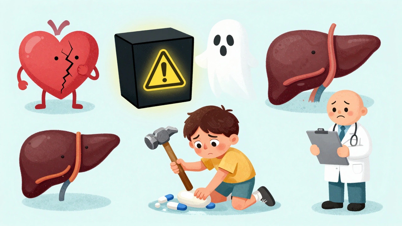
The FDA doesn’t just slap on random phrases. Each warning has to meet strict criteria. For example, a “Black Box Warning” is the highest level of alert. It’s used only when a drug has been linked to death or serious injury-like liver failure, heart problems, or suicidal thoughts. About 40% of new drugs approved between 2013 and 2017 carried one of these. If you see a thick black border around a warning on your prescription insert, stop and read it carefully. This isn’t just fine print-it’s critical.
Color Coding: Red Means Danger, But Not Everyone Knows That
You’ve probably noticed that some labels are red, others are yellow, blue, or white. That’s not random either. Studies show patients naturally associate colors with risk levels. Red means “stop.” Yellow means “be careful.” Blue and green often get ignored as “just advice.”A 2017 study found that 85% of people correctly understood a red label saying “Do not drive” as a serious warning. But only 45% took a blue label with the same message seriously. That’s dangerous. One patient told a pharmacist they didn’t think “blue sticker = don’t operate machinery” applied to them because “it didn’t look urgent.” They got behind the wheel after taking a new painkiller, had a seizure, and crashed.
Pharmacies don’t always use color consistently. Some use red for all warnings. Others save it only for the most critical ones. That’s why you can’t rely on color alone. Always read the words. Even if the sticker is green, if it says “May cause severe dizziness,” treat it like red.
What Common Warnings Actually Mean (And What People Get Wrong)
Here’s the truth: many warnings are written in confusing language-even when they’re supposed to be simple.“Take on an empty stomach.” Most people think that means “don’t eat right before.” But it actually means no food for at least one hour before and two hours after. If you take your antibiotic with toast and coffee, you might not absorb enough of it. The infection won’t clear. You’ll feel worse. And you might end up needing a stronger drug.
“Do not crush or chew, swallow whole.” This one trips up a lot of people. Some think it means “don’t swallow it whole because it’s too big.” So they crush it. That’s deadly with extended-release pills. Crushing them releases the full dose all at once. One man crushed his blood pressure pill because he couldn’t swallow it. He died from a sudden drop in blood pressure.
“Avoid sunlight.” This isn’t about getting a tan. It means the drug makes your skin dangerously sensitive. You can get a severe burn in minutes-even through a window. One woman took a common antibiotic and sat near her kitchen window for 15 minutes. She got second-degree burns on her arms and face.
“Take with food.” Many skip this because they think “food” means a snack. But it needs to be a full meal. A small cracker won’t cut it. If you take certain medications on an empty stomach, you can get nausea, vomiting, or stomach bleeding.
Why People Ignore Warnings (And How to Stop It)
You’re not alone if you’ve ignored a label. A 2022 Healthline survey found 64% of people have skipped at least one warning. The most common? “Take with food” and “avoid sunlight.”Why? Three big reasons:
- They think the warning doesn’t apply to them.
- They don’t understand the terms.
- They’re in a rush.
One patient on Drugs.com said they threw away the paper that warned against grapefruit juice with their blood pressure pill. Two weeks later, they ended up in the ER with dangerously low blood pressure. Grapefruit doesn’t just interact with one drug-it can make some medications 3 to 5 times stronger. That’s not a myth. It’s science.
And here’s the kicker: most people spend less than 10 seconds reading their label. At CVS pharmacies, researchers timed patients. The average was 7.3 seconds. That’s not enough to catch anything important.
What Works Better: Verbal Help + Simple Language
The FDA knows the current system isn’t working. Only 55% of patients understand standard warning labels. But in pilot programs at Kaiser Permanente, they switched to plain language and got 89% comprehension.Instead of “Contraindicated with grapefruit,” they wrote: “Don’t eat or drink grapefruit. It can make your medicine too strong and hurt your heart.”
And when pharmacists added a quick verbal check-asking patients to explain the warning back in their own words-comprehension jumped 47%. This is called the “teach-back” method. It’s simple: after the pharmacist gives you the warning, they ask, “Can you tell me in your own words what you need to avoid?”
If you say, “I can’t drink orange juice,” and they meant grapefruit, they catch it right then. No ER visit. No hospital stay.
The Future Is Changing-But Slowly
In 2023, the FDA approved the first set of universal icons for prescription labels. One new symbol-a pill with a red slash through it-means “do not crush.” In tests, misinterpretation dropped from 31% to just 8%. That’s a huge win.By June 2025, 20 high-risk drug classes must come with simplified “Facts Labels” on the bottle. These will use short sentences, bigger fonts, and clear icons. QR codes are also being tested. Scan it, and a 30-second video plays explaining the warning in plain English.
But here’s the catch: not all pharmacies are ready. Only 37% use the best-practice designs recommended by safety experts. Independent pharmacies often stick with old templates because changing them costs money. Chain pharmacies like Walgreens have better systems-92% patient comprehension in their safety checks. Smaller ones? As low as 68%.
What You Can Do Right Now
You don’t have to wait for the system to fix itself. Here’s what to do every time you get a new prescription:- Check the pill’s appearance. Does it match the picture on the label? If it looks different, ask. Pills can change shape or color if the manufacturer switches.
- Look for color. Red? Yellow? Don’t skip it.
- Read every word-even if it’s small. Don’t assume you know what it means.
- Ask the pharmacist: “Can you explain this sticker in plain words?”
- Repeat it back. Say: “So if I take this with grapefruit, I could have a heart problem?” If they say yes, you got it right.
- Keep the paper insert. Don’t throw it away. It has the full list of side effects and interactions.
If you’re on multiple medications, keep a list of all your warnings in your phone or wallet. Update it every time you get a new prescription. One woman kept a note in her phone: “Don’t take X with Y. Don’t drink grapefruit. Causes dizziness.” She saved her own life when her new doctor prescribed a drug that clashed with her old one.
Final Thought: This Isn’t Just About Reading-It’s About Understanding
Prescription labels are not designed to be read like a novel. They’re designed to be read like a safety manual. And like any safety manual, you have to treat them seriously. Ignoring a warning isn’t being rebellious-it’s gambling with your health.Medication errors cause 1.3 million injuries and 7,000 deaths each year in the U.S. Most of those are preventable. You don’t need a medical degree to understand your label. You just need to slow down, ask questions, and never assume you know what it means.
The sticker on your bottle isn’t just ink on paper. It’s a lifeline. Don’t ignore it.

Comments (14)
Deborah Andrich
Red sticker = don't mess around. Blue one? Still read it. I learned this the hard way after taking that antibiotic near a window and looking like a boiled lobster. Never again.
Donna Hammond
So many people think 'take with food' means a handful of chips. It needs to be a real meal-protein, fat, carbs. Otherwise you're just wasting your meds and risking stomach damage. Pharmacists should enforce this better.
Sheldon Bird
My grandma always made me read the label out loud before taking anything. She said if you can't explain it, you don't own it. Still do it. 🙌
Webster Bull
Labels aren't suggestions-they're legal contracts with your body. Skip one and you're gambling with your liver, your heart, your brain. No free rolls in medicine.
nithin Kuntumadugu
They say 'FDA' but really it's Big Pharma pushing these labels so you'll keep buying more pills. The real danger? The system itself. 🤡
Jade Hovet
OMG I JUST REALIZED I’VE BEEN CRUSHING MY BP PILLS BECAUSE THEY WERE TOO BIG 😭 THANK YOU FOR THIS POST!! I’M CALLING MY PHARMACY RIGHT NOW 🙏💊
Karen Mccullouch
Why do we even have to read these? Why isn’t the drug just safe? This country is so backwards. I don’t have time for this nonsense.
Michael Gardner
Actually, the FDA doesn’t require color coding. That’s just pharmacy branding. Red doesn’t mean danger-it means they ran out of yellow stickers. You’re being manipulated by aesthetics.
Harriet Wollaston
My mom used to say, 'If the paper came with it, it’s important.' I still keep every insert in a shoebox. I’m 67 and never had a bad reaction. Simple habits save lives.
John Fred
From a clinical perspective, the teach-back method is gold standard. It leverages cognitive load theory and reduces confirmation bias. When patients restate in vernacular, retention spikes 47%. This isn't anecdotal-it's evidence-based.
Willie Onst
Y'all ever notice how the warning about grapefruit is always the one people ignore? Like, it's not a myth, it's a metabolic trap. I told my cousin this and he still drank grapefruit juice with his statin. Now he's on dialysis. 🤦♂️
sharon soila
Every time you pick up a prescription, pause. Breathe. Read the sticker. Then say it out loud. This is not a burden-it is your right to live. Your body deserves this moment of attention.
Tommy Watson
So you’re telling me I need to read tiny print while my kid screams for snacks and the pharmacist is on the phone? Nah. I’ll just Google it later. Or hope for the best. 😴
Richard Ayres
It's interesting how the system relies on individual vigilance rather than systemic design. If labels were standardized, universally readable, and enforced at point-of-sale, we wouldn't need 7,000 deaths a year to motivate change.